Your brand speaks volumes about you.
Your brand is more than just your logo. The colors, fonts, and style of every piece you use to market your business must be in agreement with your logo. Your brand communicates what kind of company you are; what your values are.
It is your first impression.
Your brand speaks. Don’t let it talk about you behind your back.
logo design
We believe all logos must meet certain criteria:
meaningful
Call it catchy, expressive or unique; your logo must stand out from the crowd. The number 1 goal of a logo is to identify, not describe. The point is to help your customer remember you when it is time to buy.
Your logo is the first impression that customers see, and it sets the tone for your business. Through use of shapes, colors and fonts, your business can be perceived as elegant or playful; traditional or modern; witty or serious. The logo must be appropriate for the for the intended audience, otherwise your audience will not take you seriously.
Simple
Logos are meant to be symbols, not images. They must look good large as well as small. Any vector will maintain quality when enlarged, but a logo must also maintain clarity when small. Too many details will get lost in a very small version of your logo.
When considering typefonts, the first rule is that your business name must be easy enough to read immediately. Legibility ALWAYS trumps creativity!
Versatile
Your logo works for you, so it must have the ability to look consistent across a wide variety of media and applications in one color, reverse color, and in any size.
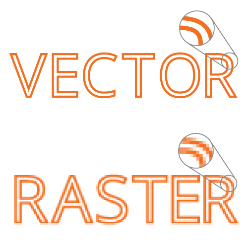
Vector graphics are made with paths, as opposed to raster graphics which are made of pixels. Think icon versus picture. The benefit of a vector file is SCALABILITY – consistent quality regardless of the size.
When you hire us to create your logo, we give you all the files you will need – including the vector file. You may not be able to open it, but you will need it for future projects.
meaningful
Your logo is the first impression that customers see, and it sets the tone for your business. Through use of shapes, colors and fonts, your business can be perceived as elegant or playful; traditional or modern; witty or serious. The logo must be appropriate for the for the intended audience, otherwise your audience will not take you seriously.
Simple
When considering typefonts, the first rule is that your business name must be easy enough to read immediately. Legibility ALWAYS trumps creativity!
Versatile
Vector graphics are made with paths, as opposed to raster graphics which are made of pixels. Think icon versus picture. The benefit of a vector file is SCALABILITY – consistent quality regardless of the size.
When you hire us to create your logo, we give you all the files you will need – including the vector file. You may not be able to open it, but you will need it for future projects.
my work
Here are some of the logos I have created of various styles and industries.
